By Jason
article copied from - sitepoint.com
Asymmetrical Balance
Asymmetrical balance, or informal balance, is a little more abstract, and generally more visually interesting, than symmetrical balance. Rather than having mirror images on either side of the layout, asymmetrical balance involves objects of differing size, shape, tone, or placement. These objects are arranged so that, despite their differences, they equalize the weight of the page. If you have a large object on one side of a page, and you partner it with several smaller items on the other side, the composition can still feel balanced.
The concert poster by my friend Jeremy Darty presented in Figure 1.11 is a fine example of asymmetrical balance. The visual weight of the large pink flamingo on the left is balanced by the combined weight of the smaller flamingos and small text blocks on the right-hand side of the layout. Notice also Jeremy's use of the rule of thirds. The blue cloud behind the Pop Sucks title takes up one-third of the vertical space and spans two-thirds of the horizontal.
Take a look at the photo of the three stones in Figure 1.12. It may not be a particularly exciting picture, but as far as balance goes, it rocks! If you were to use a piece of paper to cover any one of the three stones below, the entire photograph would feel unbalanced and unfinished. This is generally the way balance works. It's as if the entire composition is in a picture frame hanging by a single nail on the wall. It doesn't take much weight on one side or the other to shift the entire picture off balance.
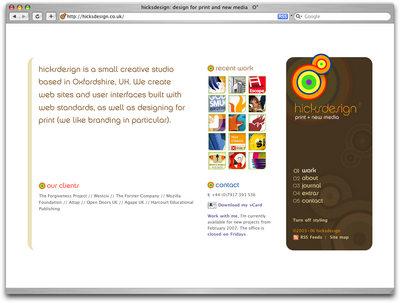
Unlike symmetrical balance, asymmetrical balance is very versatile, and as such, it's used much more often on the web. If you take a look at most two-column web site layouts, you'll notice that the larger column is often very light in color--a tactic that creates a good contrast for the text and the main content. The diminutive navigational column is often darker, has some sort of border, or is made to stand out in some other way, in order to create balance within the layout. John Hicks's site, Hicksdesign, which is shown in Figure 1.13, is an excellent example of asymmetrical balance. The heavy brown sidebar, which contains the logo and main navigation for the site, stays fixed on the right-hand side of the layout even when the content scrolls. This ever-present element provides interest and balance to the rest of the content on the page.

Figure 1.13: Hicksdesign--an example of asymmetrical balance
Many principles are at work in the design of John Hicks's site--this design isn't just about asymmetrical balance. The site has great harmony, which comes from the repeated, brightly colored bullets, similarly colored headers, and consistent typefaces. Part of that harmony arises from the fact that the site meets the principles of unity.
Unity
Design theory describes unity as referring to the way in which the different elements of a composition interact with one another. A unified layout is one that works as a whole rather than being identified as separate pieces. Take the monkeys in Figure 1.14, for example. Their similar colors and shapes mean that they can easily be recognized as forming a group, rather than merely being four monkeys.
Although it's not such an issue these days, unity is one of the many reasons why web designers have always despised HTML frames. It's important that unity exists not only within each element of a web page, but across the entire web page--the page itself must work as a unit. We can use a couple of approaches to achieve unity in a layout (aside from avoiding frames): proximity and repetition.
Proximity
Proximity is an obvious, but often overlooked way to make a group of objects feel like a single unit. Placing objects close together within a layout creates a focal point toward which the eye will gravitate. Take a look at the digital painting in Figure 1.15. While composed of a seemingly random assortment of strokes, the five strokes that are the closest together appear to form a unified object.

Figure 1.15: Creating a group using proximity
We practice the concept of proximity on the Web when we start setting margins and padding for elements. For instance, when I define the CSS style rules for most sites, I usually change the default margin that exists between common HTML elements such as headings (h1, h2, h3 ...), paragraphs, blockquotes, and even images. By altering these values, I can cause more or less space to appear between elements, thereby creating groups.
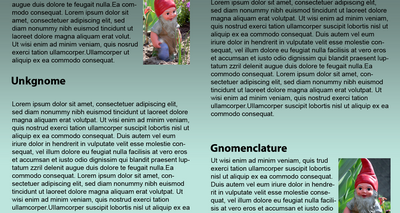
If you look at the two columns of text in Figure 1.16, you'll notice that they look very similar. The only difference is in the placement of the headings. In the column on the left, the word "Unkgnome" is equi-distant from the top and bottom paragraphs. This results in a heading that looks more like a separator than a heading for the next paragraph. In the second column, the "Gnomenclature" heading is placed closer to the paragraph that follows it. In accordance with the rules of proximity, this heading appears to belong to that block of text.

Figure 1.16: Proximity between headers and content
Repetition
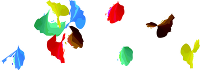
A gaggle of geese, a school of fish, a pride of lions. Any time you bring a set of like items together, they form a group. In the same way, repetition of colors, shapes, textures, or similar objects helps to tie a web page design together so that it feels like a cohesive unit. The example in Figure 1.17 illustrates repetition. Even though there are other similar strokes around, the nine red strokes on the left-hand side appear to be a unified group because they repeat a shape, color, and texture. The strokes to the right of this group have no repeated pattern, so they appear isolated even though there are other shapes nearby.

Figure 1.17: Creating a group using repetition
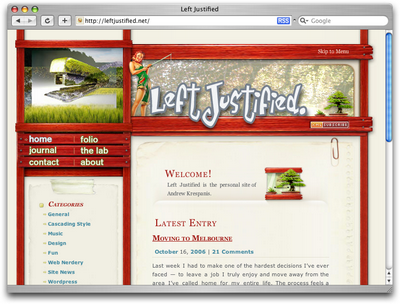
Whether you notice it or not, repetition is often used in web site designs to unify elements of the layout. A good example of this concept at work among unmodified HTML elements is the bulleted list. The bullet that precedes each list item is a visual indicator that the bullet items are parts of a whole. Repeated patterns and textures can also help to unify a design. Take a look at the screenshot of Left Justified, the personal site of Australian designer Andrew Krespanis. This layout contains many eye-catching elements, but the repeated use of the red wood texture in the header, menu, and page borders literally hold this design together.

Figure 1.18: Left Justified homepage
This is my first time visit here. From the tons of comments on your articles.I guess I am not only one having all the enjoyment right here! Good wishes from GrafWeb.
ReplyDelete