By Jason
article copied from - sitepoint.com
Bread-and-butter Layouts
Most of what we've talked about thus far has been design theory. Theory's good, but it can only take us so far toward understanding why some ideas work--and others don't--in a web site's design. In my opinion, examples and practice are much more valuable. Most academic graphic design programs include a curriculum that's rich in art history and fine art. These classes provide a great foundation for an understanding of graphic design from an art perspective, but they do little to prepare you for the specific challenges you encounter when you take your designs to the Web.
Pablo Picasso once said, "I am always doing that which I can not do, in order that I may learn how to do it." While I like to take that approach when designing a new web site, it's important first to know what you can do. When you look out across the Internet, you can see that the possibilities for layout really are endless. But, as I said before, only a few of those possibilities make good design sense. That's why we see certain configurations of identity, navigation, and content over and over again.
In this section, we'll talk about a few of the most common layouts, and explore some of their advantages and disadvantages.
Left-column Navigation
Regardless of whether we're talking about liquid or fixed-width layout design, the left-column navigation format is the de facto standard. The ThinkGeek site, pictured in Figure 1.24, is a classic example of this configuration. Many sites that fit into this mold don't necessarily use the left column as the main navigation block--sometimes you'll see the navigation along the top of the page--but they still divide the layout below the header into a narrow (one-third or less) left column and a wide right column. It's a status quo, like a security blanket, or that comfortable shirt with holes in the armpits that you wear once a week even though it drives your spouse crazy. For those reasons, a layout featuring left-column navigation is a safe choice for any project.
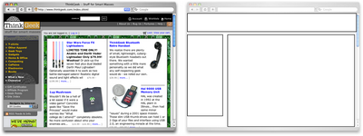
Figure 1.24: Left-column navigation at ThinkGeek
The downside to sites that use left-column navigation is that they can lack creativity. They've been done so many times, and in so many ways, that they tend to look the same. That's not to say you shouldn't use a left-column navigation layout. I'd guess that 75% of the sites I've designed have been based on the left-column navigation model, but I try to do something different when I can.
Speaking of different, how about picking that left column up and sticking it on the other side of the content? Then you'd have a right-column navigation layout.
Right-column Navigation
Although it's difficult to find sites like Audi's (depicted in Figure 1.25) that place the main site navigation along the right-hand side of the layout, it's quite easy to find sites that use a right-hand column for sub-navigation, advertising, or sub-content. Since, in western cultures, our eyes scan from left to right, this allows the page's main content to be the first thing viewers see.
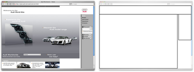
Figure 1.25: Right-column navigation on Audi's web site
I'm not sure why there aren't more sites that make use of the right column. The studies I've seen tend to swing both ways in regards to the usability and practicality of right-hand menus. In my own experience, my cursor tends to hover on the right side of the browser window anyway--so I can be closer to the scrollbar.
Ultimately, this is a judgement call that's really about the needs of your clients and how they want people to perceive their online presence. Left-column navigation is familiar and more standard, but that's not always the number one priority in designing a new site. One thing's for sure, though: if you want your design to be different from the average web site, but you still want users to be able to find your navigation, you should give a right-column layout a try.
Three-column Navigation
The typical three-column layout has a wide center column flanked by two diminutive navigational columns. The Apple Store web site shown in Figure 1.26 is an example of this common web page layout staple. Although three columns may be necessary on pages that have a ton of navigation, short bits of content, or advertising to display, it's important to remember that whitespace is essential if we are to keep a layout from appearing cluttered. Fortunately at the Apple Store, the three columns only exist on the homepage, and the center column has some whitespace that helps to promote eye movement.
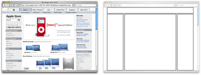
Figure 1.26: Three-column navigation at Apple Store
Getting Inspired
Just because the left-, right-, and three-column layout configurations are the bread and butter of most web page designs doesn't mean you have to be confined to these layouts. A plethora--yes, a plethora--of design showcase and gallery sites have been created to feature new and innovative ideas that might help you think outside the box, including the following (just to name a few):
- CSS Zen Garden at http://www.csszengarden.com/ -- This site is the original showcase of fresh ideas for CSS. Even if you don't intend to design a CSS Zen Garden template, it's a great source of inspiration.
- CSS Beauty at http://www.cssbeauty.com/ -- CSS Beauty is both a gallery of well-designed CSS web sites and a portal to the CSS design community.
- Stylegala Gallery at http://www.stylegala.com/archive/ -- Stylegala is a great source of information about web design and standards, but the gallery features only the best-of-the-best new CSS designs.
- CSS Vault at http://cssvault.com/ -- The CSS Vault's gallery archive goes back to November 2003, so it's not only a great source of inspiration, but a historical repository of great CSS design.
- Design Interact Site of the Week at http://www.designinteract.com/sow/ -- Just for good measure, here's one gallery that doesn't concentrate on CSS-based designs. Design Interact is the multimedia- and technology-focused spin-off of Communication Arts, a leading trade journal for visual communication and graphic design. Design Interact has been highlighting (and archiving) a new and unique web site every week since January 1998.
Using a Morgue File
I know what you're thinking: "Great, I've got a bunch of galleries to look at, now what?" One of the most useful "tings" my first graphic design professor taught me was to create a morgue file whenever I worked on a large project. The concept is pretty simple: if you're doing an illustration or marketing project that involves trains, you clip out and print up anything you can find that might give you inspiration and keep it all in a folder. It helps with your current project, and should you ever need to do another project involving trains, you'll have lots of inspiration on hand.
The morgue file idea kind of slipped my mind until a few years ago when I was working on a web site layout. I found myself looking for a similar layout to the one I wanted to create--in particular, I wanted to see how other designers handled the background textures for such a design. That was when I decided to start my digital morgue file. I started taking screenshots of sites I saw in some of the galleries listed above, and sorted them into folders with names such as "leftnav," "rightnav," "3column," and "oddball." Having a repository of web site designs that I can look at any time has been a handy resource on countless occasions when I've been looking for inspiration.
Fresh Trends
If you're feeling so overwhelmed by the above resources that you can't even contemplate starting a morgue file for inspiration, just take a few minutes to browse through those sites. Look past the colors and textures to the boxes that make up the layout, and try to identify common ideas and design trends. By doing this, I've started to notice a few trends that seem to be emerging in web site layouts.
Expansive Footer Navigation
If you scroll to the bottoms of pages on many of the most recently redesigned sites, you're likely to see an interesting new trend. Rather than using the footer for main links and a copyright notice, many sites are expanding this neglected piece of page real estate to include contact information, expanded site navigation, and extra content such as blogrolls, linkrolls, Flickr badges, and so on. Although putting a site's main navigational element at the bottom of the page isn't a good idea, the concept of including "bonus" navigation and content in that space has taken off lately. As Figure 1.27 shows, JeffCroft.com is just one of the sites trying this approach.
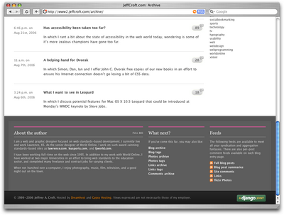
Figure 1.27: Presenting extra content in the footer at JeffCroft.com
Three Columns with Content First
The majority of fresh three-column site designs that have been produced lately have put the content first. By first, I mean they're locating the content on the far left of the display. As you can see in Figure 1.28, this approach produces a very modern and professional look for Vivabit.
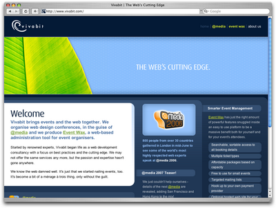
Figure 1.28: Putting content first at Vivabit.com
Although this isn't really a new idea, it's been picking up a lot of steam lately in both liquid- and fixed-width site designs. The majority of three-column layouts usually switch to a two-column structure outside the homepage. By placing the content on the left, the transition from three columns to two is more natural, as the content column can simply expand, rather than having to relocate completely. For example, if you visit any of the other main pages of the Vivabit site, the width of the content area seems simply to expand up and to the right when you navigate from the homepage into the site.
See also:
- Veerle's Blog, at http://veerle.duoh.com/
- Django, at http://www.djangoproject.com/
Resizing: Fixed Width vs. Liquid Width
Back when we were drawing layout blocks with pencil and paper, I explained that the first page element we had to think about was the containing block, and whether or not it would expand to fill the page. This decision is one that has plagued web designers for hundreds, if not thousands of years--all the way back to the days when we used tables and spacer.gif files to layout web page content. Okay, maybe that wasn't actually thousands of years ago, but this is a long-standing debate nonetheless. In fact, the fixed-versus-liquid debate caused quite a bit of commotion back in December 2003 when two very influential designers, Douglas Bowman of Stopdesign and Dan Cedarholm of SimpleBits, simultaneously switched from liquid- to fixed-width layouts. This caused instant and unwarranted panic among the design and web standards community, whose members feared that this move marked the death of liquid layouts.
Since then, most designers have established their own opinions in regard to the fixed-versus-liquid debate. The decision to use one type of layout over the other should really be determined by the target audience and the accessibility goals of each individual web site. The pros and cons of each layout type are fairly well-defined, as Table 1.1 illustrates.
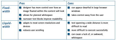
Table 1.1: Fixed- vs. liquid-width layouts--the pros and cons
With these pros and cons in mind, I've designed more fixed-width layouts than liquid. I like having control over how the content will display, and working with the background space. On the flip side, I sometimes enjoy the challenges that liquid layouts bring to the table. But, regardless of personal preferences, it's important to put the needs of your client first. If you're deciding on the width of a fixed-width layout, you have to think about the audience for which you're designing, and create a layout that meets the needs of those users.
An Alternative: Variable Fixed-width Layout
The somewhat ironic term variable fixed-width layout was coined by Richard Rutter in an article that he wrote to catalog his findings about this new trend. It's an excellent discussion of the topic that provides some great examples.
The homepage of Simon Collison's Colly Logic exhibits the best implementation I've seen of this new trend. When you expand your browser window from 800 pixels to 1024 pixels in width, the right-hand column splits into a third column. Figure 1.29 shows how it works.
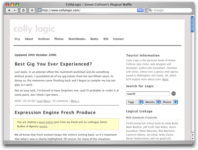
Figure 1.29: Viewing Colly Logic at 800 and 1024 pixel widths
Colly Logic acts as an intermediary between fixed- and liquid-width design. A handful of designers have been toying with this idea; CSS Beauty, one of the CSS gallery sites I mentioned earlier, takes a variable fixed-width approach to displaying features and advertising content.
No comments:
Post a Comment