article copied from - sitepoint.com
Implementation
The next step in the design process is to take what you've learned from the client and use it to create a design. Regardless of the project, try not to get caught up in the technology associated with building web sites--at least not at first. At this point, it shouldn't matter whether the site is going to comprise straight HTML, a template for a content management system, or a Ruby on Rails application; the bottom line is that we have an interface to design and a blank sheet of paper. "Paper?" That's right, paper. Did you really think I was going to let you get back to your precious computer right after the client meeting was over? No way. Here's why: it's easy to lose focus on the design if you start thinking about the layout in front of a computer. If you start out on paper, you can ignore the technical limitations of browsers and CSS, and focus on how you want the final product to look. Now you might think that all good designers carry around fancy hardbound sketch books in which they use expensive markers and paint to design masterpiece renderings of web page layouts. For me, the equivalent is a 79-cent spiral-bound notebook and any writing instrument I can find on my desk that still works.
I start out by sketching a few possible layouts. After a few of these sketches, I decide on one I like, jump into Photoshop, and use the rectangle tool to block out the areas I've marked down on my paper. Once I've defined my layout, I experiment with foreground and background colors until I have a solid color scheme. I continue twiddling the Photoshop knobs and pushing around pixels until, finally, I have a comp to show the client.
Simple, right? Okay, perhaps I skipped a few steps in that brief description. Honestly, though, when people ask me how I do what I do, they usually get a similar explanation. The truth is that there are bundles of now-subconscious information from my past experience and those old college design and art classes that have helped me to define my own design process.
Learning how to design is like learning how to program. Some people have a bit of a knack for it, but anyone can learn. Just as there is good code and ugly code, there is good design and ugly design. Learning some of the principles and conventions that are associated with design will help you to understand the difference between the good and the ugly, and help you toward establishing your own design process.
Defining Good Design
There are two main standpoints from which most people determine whether a web site design is "good" or "bad." There's a strict usability standpoint, which focuses on functionality, the effective presentation of information, and efficiency. Then there's the purely aesthetic perspective, which is all about presentation, hot animations, and sexy graphics. Some designers get caught up in the aesthetics and graphics and forget about the user, and some usability gurus get lost in their user testing and forget about visual appeal. In order to reach people and retain their interest, it's essential to maximize both.
The most important thing to keep in mind is that design is about communication. If you create a web site that works and presents information well, but looks ugly or doesn't fit with the client's brand, no one will want to use it. Similarly, if you make a beautiful web site that isn't usable and accessible, people may not be able to use it. Indeed, the elements and functionality of a finished web site design should work as a single cohesive unit, so that:
Users are pleased by the design but drawn to the content
One of the biggest concerns among usability professionals is the time it takes users to scan the page for the information they want, be it a piece of content, a link to another page, or a form field. The design should not be a hindrance; it should act as a conduit between the user and the information.
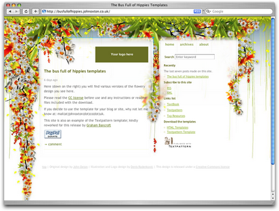
John Oxton's Bus Full of Hippies template (pictured in Figure 1.2) is a great example of a design that's both beautiful and usable. The colorful graphics grow around the blocks of content, leading the eye back to the information without interfering with the pages' readability or organization.

Figure 1.2: The Bus Full of Hippies template
Users can move about easily via intuitive navigation
We'll talk more about the placement of navigation later, but the main navigation block itself should be clearly visible on the page, and each link should have a descriptive title. A navigation structure that not only changes appearance on mouse hover, but also indicates the active page or section, as does the menu shown in Figure 1.3, helps users recognize where they are, and how to get where they want to go.

Figure 1.3: A navigation menu from Iconfactory's Halloween 2006 theme
Secondary navigation, search fields, and outgoing links should not be dominant features of the page. If we make these items easy to find, and separate them visually from the content, we allow users to focus on the information, though they'll know where to look when they're ready to move on to other content.
Users recognize each page as belonging to the site
Even if there's a dramatic difference between the layout of the homepage and the rest of the site, a cohesive theme or style should exist across all the pages of a site to help hold the design together.
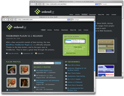
Take a look at the screenshots of Steve Smith's Ordered List in Figure 1.4. Although the content blocks on these pages are divided differently, there are several visual indicators that let users know that these are pages from the same site. Much of this unity is due to the repetition of the identity and navigation blocks. The consistent use of a very limited color palette (black, white, green, and cyan) also helps to unify the pages.

Figure 1.4: Pages from Ordered List
Web Page Anatomy

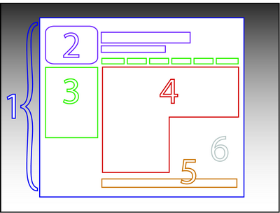
Figure 1.5: The anatomy of a web page
Even from a non-designer's standpoint, defining a design that satisfies all of the requirements I outlined above is a simple task. It's similar to making a phrase on your refrigerator with magnetic poetry words. Although there are millions of ways to arrange the words, only a few arrangements make any sense. The magnetic poetry words are like the components, or blocks, of the web page. Although the number of these necessary blocks depends on the size and subject of the site, most web sites have the following components, as shown in Figure 1.5.
Containing Block
Every web page has a container. This could be in the form of the page's body tag, an all-containing div tag, or (and I really don't want to say this, but) a table. Without some sort of container, we would have no place to put the contents of our page. The elements would drift beyond the bounds of our browser window and off into empty space. The width of the container can be liquid, meaning it expands to fill the width of the browser window; or fixed, so that the content is the same width no matter what size the window is.
Logo
When designers refer to an identity, they're referring to the logo and colors that exist across a company's various forms of marketing, such as business cards, letterhead, brochures, and so on.
The identity block that appears on the web site should contain the company's logo or name, and sit at the top of each page of the web site. The identity block increases brand recognition and lets users know that the pages they're viewing are part of a single site.
Navigation
It's essential that the site's navigation system is easy to find and use. Users expect to see navigation right at the top of the page. Whether you plan to use vertical menus down the side of the page, or a horizontal menu along the page's top, the navigation should be as close to the top of the layout as possible. At the very least, all main navigation items should appear "above the fold."
Content
Content is king. A typical web site visitor will enter and leave a web site in a matter of seconds. If visitors can't find what they're looking for, they will undoubtedly close the browser or move on to another site. It's important to keep the main content block as the focal point of a design so that precious seconds aren't wasted as visitors scan the page for the information they need.
Footer
Located at the bottom of the page, the footer usually contains copyright, contact, and legal information, as well as a few links to the main sections of the site.
By separating the end content from the bottom of the browser window, the footer should indicate to users that they're at the bottom of the page.
Whitespace
The graphic design term whitespace (or negative space) literally refers to any area of a page that's not covered by type or illustrations. While many novice web designers (and most clients) feel a need to fill every inch of a web page with photos, text, tables, and data, having empty space on a page is every bit as important as having content. Without carefully planned whitespace, a design will feel closed in, like a crowded room. Whitespace helps a design to "breathe" by guiding the user's eye around a page, but also helps to create balance and unity--two important concepts that we'll discuss in more detail later in this chapter.
At this point, we've had our initial meeting with Mr. Smith, our theoretical client, and it was very helpful. He explained very thoroughly what he does and what he wants the site to achieve. Even though we don't have actual content yet, we can use the standard blocks of web page anatomy to start developing a layout. Although other site-specific blocks are worked into the designs of many web site layouts, the web page anatomy works to summarize the most common blocks.
Now that we have this information, how can we use it to create a foundational layout for Smith's Services? It's time for some grid theory.
No comments:
Post a Comment