article copied from - sitepoint.com
Grid Theory
When most people think about grids, they think about engineering and architecture. However, the grid is an essential tool for graphic design as well.
Using a grid is not just about making things be square and line up: it's about proportion as well. That's where the "theory" comes into grid theory. Many art historians credit Dutch painter Piet Mondrian as the father of graphic design for his sophisticated use of grids. Yet classical grid theory has influenced successful artistic efforts for thousands of years. The concept of dividing the elements of a composition extends back to the mathematical ideas established by Pythagoras and his followers, who defined numbers as ratios rather than single units.
The Pythagoreans observed a mathematical pattern that occurred so often in nature that they believed it to be divinely inspired. They referred to this pattern as the golden ratio or divine proportion. The basic idea is illustrated in Figure 1.6. A line can be bisected using the golden ratio by dividing its length by 1.62. This magical 1.62 number is really 1.6180339 ... It's an irrational number that's usually represented as Φ (pronounced phi). Explaining the math used to come up with this number is a bit too involved for this discussion, and isn't really going to help you become a better designer, so I'll spare you the details. Besides, my math is a little rusty.

Figure 1.6: The golden ratio
So just what does this ratio have to do with graphic design? In general, compositions divided by lines that are proportionate to the golden ratio are considered to be aesthetically pleasing. The artists of the Renaissance used divine proportion to design their paintings, sculpture, and architecture, just as designers today often employ this ratio when creating page layouts, posters, and brochures. Rather than relying on artistic notion, divine proportion gives us logical guidelines for producing appealing layouts.
The Rule of Thirds
A simplified version of the golden ratio is the rule of thirds, or in the native accent of one of my graphic design professors, "rule of turds." A line bisected by the golden ratio is divided into two sections, one of which is approximately twice the size of the other. Dividing a composition into thirds is an easy way to apply divine proportion without getting out your calculator.
To start the pencil-and-paper version of your layout, draw a rectangle. The vertical and horizontal dimensions don't really matter, but try to keep straight lines and 90-degree angles.
Now, divide your rectangle horizontally and vertically by thirds. As I said before, don't start thinking about technology yet.
Next, divide the top third of your layout into thirds again.
Finally, divide each of your columns in half to create a little more of a grid.
You should have a square on your paper that looks similar to the rule of thirds grid in the final diagram of Figure 1.7. Go ahead and repeat the above steps so that you have a few rule of thirds grids in which to try different layout options.
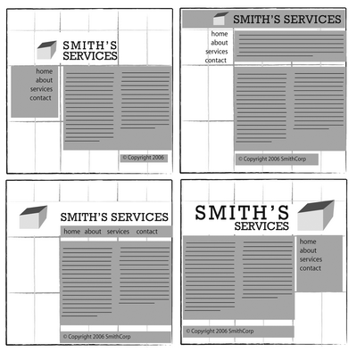
With this simple gridwork in place, we can begin to lay out our elements. The large, main rectangle represents the container that we talked about in the section called "Web Page Anatomy." When using this method of layout design, I like to place the biggest block first. Usually, that block represents the content. In my first rule-of-thirds grid, I place the content block within the two-thirds of the layout at the lower right. Next, I place my navigation block in the middle third of the left-hand column. I place the text part of the identity block over the left side of the content, and the image part of the identity over the menu. Finally, I squash the copyright block below the content, in the right-hand column of the grid. The result is the top-left of the four possible layout arrangements shown in Figure 1.8.

Figure 1.8: Four layouts in grids that follow the rule of thirds
As you experiment with different arrangements, use the lines that create the three main columns as alignment guides for the identity, navigation, content, and footer blocks. It's very tempting to arrange all your elements along one particular line, but try not to let this happen--it's not very interesting visually. Instead, consider pushing part of the block over that line, as I did with the identity block in the examples in Figure 1.8.
Another tendency for non-designers working on layouts is to center-align everything on a page. The grid system prevents us from doing that, but there is a reason why we tend to want to center everything. That reason is a desire for balance.
Balance
In a figurative sense, the concept of visual balance is similar to that of physical balance illustrated by a seesaw. Just as physical objects have weight, so do the elements of a layout. If the elements on either side of a layout are of equal weight, they balance one another. There are two main forms of visual balance: symmetrical and asymmetrical.
Symmetrical Balance
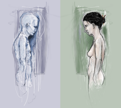
Symmetrical balance, or formal balance, occurs when the elements of a composition are the same on either side of an axis line. The digital painting Contemplation by David Lanham, shown in Figure 1.9, is a great example of this concept. Notice how the male and female figures in this painting are almost the same in position and proportion. Even the shaded background boxes are mirror images of one another.

Figure 1.9: Symmetrical balance--Contemplation by David Lanham
Although it may not be practical for all designs and clients, this type of symmetry--called horizontal symmetry--can be applied to web site layouts by centering content or balancing it between columns. The Grow Collective web site is an example of such symmetry. Notice on the page shown in Figure 1.10 that the content areas graduate from a single column at the very top of the page, to two columns, to three columns at the bottom of the window; yet the layout still maintains its symmetrical balance. Most of the rest of the site's content is divided into symmetrical columns as well.

Figure 1.10: Grow Collective web page
The two other forms of symmetrical balance are less common in web site design, due to the nature of the medium. However, they're commonly exhibited in logo and print design. These are:
- bilateral symmetry, which exists when a composition is balanced on more than one axis
- radial symmetry, which occurs when elements are equally spaced around a central point
No comments:
Post a Comment