By Jason
article copied from - sitepoint.com
Emphasis
Closely related to the idea of unity is the concept of emphasis or dominance. Rather than focusing on getting the various elements of a design to fit together, emphasis is about making a particular element draw the viewer's attention. When you design a web page layout, often you'll identify an item in the content, or the layout itself, that you want to stand out. Perhaps it's a button you want users to press, or an error message that you want them to read. One method of achieving such emphasis is by making that element into a focal point. A focal point is anything on a page that draws the viewer's eye, rather than just feeling like part of the page as a whole or blending in with its surroundings. As with unity, there are a few tried and true methods of achieving a focal point.
Placement
Although the constraints of practical web design do not often allow for it, the direct center of a composition is the point at which users look first, and is always the strongest location for producing emphasis. The further from the center an element is, the less likely it is to be noticed first; for an example of this, see Figure 1.19.

Figure 1.19: Continuance and placement--creating emphasis
Continuance
The idea behind continuance is that when our eyes start moving in one direction, they tend to continue along that path until a more dominant feature comes along. Figure 1.19 demonstrates this effect. Even though the bottom splotch is bigger and tends to catch your eye first, your brain can't help but go "Hey, looky there, an arrow!" You'll soon find yourself staring at the smaller object.
Continuance is also one of the most common methods that web designers use to unify a layout. By default, the left edge of headings, copy, and images placed on a web page form a vertical line down the left side of a page before any styling is applied. A simple way to expand on this concept is to use the rule of thirds to line up other page elements along the lines of your grid.
Isolation
In the same way that proximity helps us create unity in a design, isolation promotes emphasis. An item that stands out from its surroundings will tend to demand attention. Even though he's sad to not be with his buddies on the other page, the isolated monkey in Figure 1.20 stands out as a focal point on the page.
Contrast
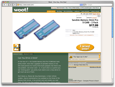
Contrast is defined as the juxtaposition of dissimilar graphic elements, and is the most common method used to create emphasis in a layout. The concept is simple: the greater the difference between a graphic element and its surroundings, the more that element will stand out. Contrast can be created using differences in color (which I'll discuss in more detail in Chapter 2), size, and shape. Take a look at Figure 1.21.

Figure 1.21: Woot--using orange for contrast
The site is Woot, an ecommerce web site that sells just one item per day. When you look at this layout, what's the first thing that grabs your attention? My guess is it's probably the product they're selling. Products at Woot change daily, though, so what grabs your eye after that? For me, it's the I want one! button. Although the same colors are used elsewhere in the design, the oval shape isn't. When set against an area of white space, the button has both contrast and isolation working to emphasize it. The owners of Woot really want you to click that button.
Proportion
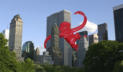
One interesting way of creating emphasis in a composition is through the use of proportion. Proportion is a principle of design that has to do with differences in the scale of objects. If we place an object in an environment that's of larger or smaller scale than the object itself, that object will appear larger or smaller than it does in real life. This difference in proportion draws viewers' attention to the object, as it seems out of place in that context.
In Figure 1.22, I've taken my monkey and superimposed him over the skyline of Manhattan to prove my point. Between the sharp contrast in color, and the difference in proportion, your brain immediately says, "Hey, something's not right here," and you're left staring at the monkey until you force yourself to look away.

Figure 1.22: Proportion--a monkey in Manhattan
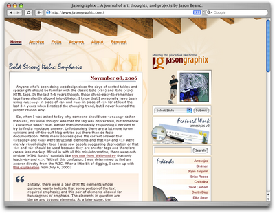
This principle works for miniaturization as well. If you take a look at my personal web site, Jasongraphix, pictured in Figure 1.23, one of the first things you might notice on the page is the mini-me leaning against my artwork just under the logo. As with the I want one! button on Woot, this little guy stands out because of contrast and isolation, but also because of the eye-catching use of proportion.

Figure 1.23: Jasongraphix--my personal site, featuring mini-me!
A few standard HTML tags and CSS properties have been designed to take advantage of the preceding theories to create emphasis in a web page even without customization. For isolation of content consider the blockquote element. This element indents the left- and right-hand side of any text placed within it, purposely breaking the continuation lines of the page content and drawing attention to itself. For positioning, consider the position property in CSS. By absolutely positioning an object with CSS, you take it out of the flow of its containing block, so you can place it strategically to draw attention. And when you think about contrast, think about the blink tag. Just kidding! Don't ever think about the blink tag. Yes, it creates contrast ... over and over and over again. Please don't use it. Don't get any ideas about using a marquee tag either. Design is just as much about what we leave out as it is about what we put in.
Next, we'll look at some well-tested examples of designs from which you can work.
No comments:
Post a Comment